Friday 31 October 2008

Where to start?

I am trying to get started on my T£N brief properly, but I don't really know where to begin. I have been trying to look for inspiration. The first thing I looked at was Make Poverty History which is possibly the closest thing to my T£N campaign.

I am a big fan of the logo which says make poverty history, whilst the words in bold say make history. Simple word play.


I think that the most important promotional aspect of Make Poverty History is the white bands that people had, which became popular very quickly, to 'show-off' that they cared about poverty:


"It's predicated on the notion that most of us would like to give to charity, but only if we get something in return and only if we can flaunt a logo showing just how good we are"

- Robert Preston
Shopping and donating are different (BBC News)

As sad as it is, I feel that my campaign needs to give people something to show that they took part in the campaign, maybe a banner that can go on their Facebook or Myspace profiles.

I also found this video of the Make Poverty History TV ad than ran for a few months before being taken off the air by Ofcom because it was seen as political....stupid, stupid, stupid.


One campaign (which I think is linked to Make Poverty History - well Bono had something to do with it) that is interesting to look at from a branding point of view is [Red] (which apparently made massive losses) - the agency responsible, I believe, is Wolff Ollins, who tried to do something similar (and shitter) for London 2012.


What is great about the (RED) branding is how adaptable it is - other companies can put their own brand inside the brackets and the two brands are instantly joined.


The other unique thing about (RED) was that the colour was instantly recognisable as most of the products that had (RED) ranges didn't normally come in red.


It would be really good if I could find some way of making the T£N brand as adaptable as (RED) so that charities and organisations could combine it with their own branding to promote themselves.

Thursday 30 October 2008

NMM coming to a close

I have finished the NMM Seasonal print. For now.

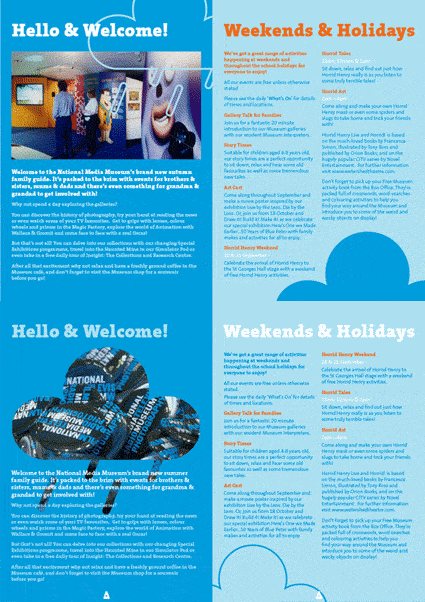
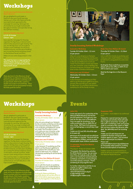
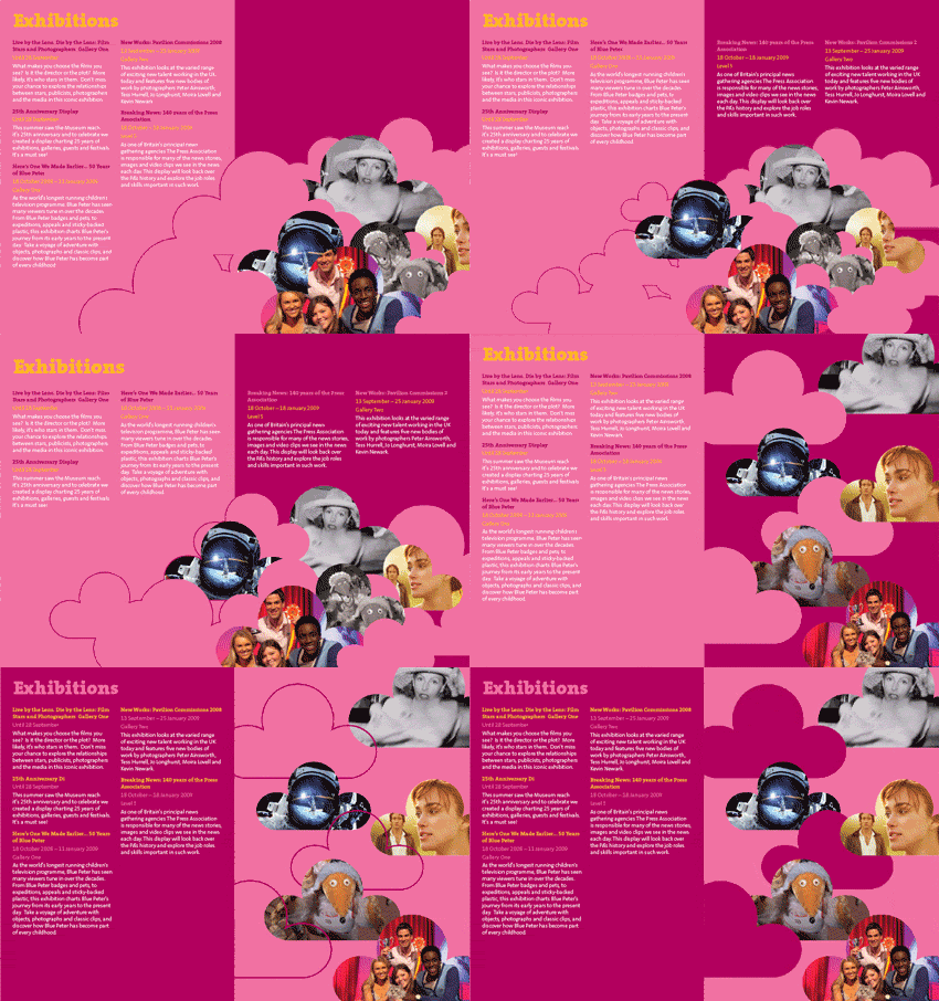
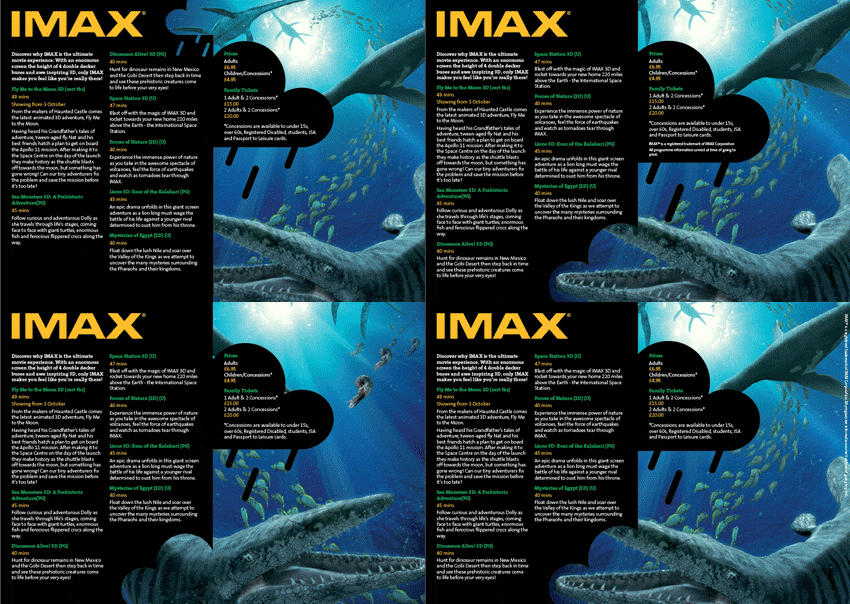
I decided to go with the rain idea. Here's my final spreads:


I really just tried to treat this as a exercise in layout. I attempted to keep with the cloud theme and use the imagery across the inside spreads to try and make them a little more lively then the other NMM Seasonals that are aimed at adults as well as families.

The GIFFs below show the evolution of some of the spreads

layout changes spread 1

layout changes spread 3

layout changes spread 2

layout changes final spread

I think thats about it for now. I'm gonna see what Thompson think of it and hopefully get some feed back from them. All thats left to do is transfer the cover imagery onto a print ad.

Thursday 23 October 2008

Finished front covers

I have decided to develop both of the cover ideas from my last post, giving me these covers:

Aesthetically, I tried keeping them sympathetic to other National Media Museum artwork. However, conceptually I have tried to take a different approach.

The question I tried to answer with these designs was ‘why would anyone choose to go to an indoor attraction in summer?’


This cover hasn't changed much, but I have done some quick mock-ups showing how this concept can be easily adapted for a poster/print campaign.


The idea behind this cover design is to show how the National Media Museum offers families a hassle free day out, in comparison to more traditional summer activities - going to the beach, fare, etc.

I have spent quite bit of time putting together the alternative rain concept cover: here are the final 2, theres not much in it really. I imagine I will go with the second one.


The main reason that I visited the National Media Museum was that I needed something to do when it was raining.

This cover idea shows how the National Media Museum is an alternative to an outdoor attraction as it offers something that many don’t
- a roof.

Sunday 19 October 2008

NMM

I went down to the train station today and found a load of leaflets for attractions.


Most of them are pretty 'samey' and boring. There were one or two interesting ones though.


The Eureka leaflets are fairly good, in terms of family fun - lots of bright colours, bold vectors and happy children. Shown here is the front cover and a A3 fold out map thing. These leaflets are a lot less formal than a lot of other leaflets that are promoting themselves as a family attraction. Isn't it common sense to make a leaflet for a fun attraction look fun?

Similar to Eureka, DIG has a nice fold out map. The rest of the leaflet has some photos of happy children, but in general is still quite formal.


There was also a few interesting folds going on


This leaflet for Hull makes up for dull design by using an interesting concertina fold that makes navigation through the leaflet easier. As does this Youth Yostel Association leaflet.


The winner though would be this Salford leaflet. It opens out like a regular booklet, but the pages are tiered out as they go back. As if that wasn't enough the corner of front has been die-cut into a nice round shape. Its also printed on a nice wholesome uncoated stock. Niiiiiccccccceeee.


I also like the way that the photos aren't in square boxes, but abstract shapes (complimenting the cover design) for this Leeds Museums & Galleries booklet.


Done.

Thursday 16 October 2008

In the beginning I created....

...a poster for the Don't Panic competition, but didn't finish it in time, so I had to enter the first version of the poster.

Here's the finished poster. I added more illustrations to the original one, I also made a new background with wet tea bags. A paper aging technique so effective it has been known to fool historians.....


Concerning the work for the 301 briefs, I am am making some headway with the first two briefs.

I started with a brief that I wrote for myself. I want to challenge myself and get people to do something that they wouldn't normally do. I decided to create a campaign to try and get people to give £10 away to any good cause.

I have been working on a name and a logo for the campaign. I was stuck between T£N, Tenner, and Change for a Tenner.

Here are some of my initial ideas:


I have settled with T£N as the title, and change for a tenner as a strap line.


I emailed Thompson Brand Partners and asked them to send me a brief. They sent me an old brief to design the National Media Museum summer leaflet/programme.

Here's the cover of the leaflet that Josh from Thompson did, it's pretty stiff competition!


I tried to think of ways to advertise an indoor attraction in the summer. The first thing I thought of was showing how an indoor attraction was better than an outdoor one as it always rains in England. I started doing this but didn't get too far with it:


I started going in a slightly different direction. I tried to show how traditional British outdoor attractions where a lot of hassle. I used images of seagulls pooing, melting ice creams, wasps, etc to show that you are much better taking the kids to an indoor attraction.

This is as far as I have got with the cover so far:


As this is aimed mainly at parents trying to avoid extra hassle, I want to do an alternative cover that is aimed at getting children's attention, and present both the ideas to Thompson.

Thats about it for now.

X.

Thursday 2 October 2008

Summer Presentation

I had to do a 10 minute presentation to the rest of my class about what I did over the summer and what I intend to do in the future.

I started by talking about my work placement at Thompson Brand Partners. It was really god, everybody was really helpful and got me working straight away. I learnt lots, but the experience also made me realise how being a designer is a realistic ambition, and that professional designers aren't too different from student designers, and professional design studios aren't that different from the College design studio.

The first piece of work that I did was designing a leaflet for the National Media Museum. This taught me about layout, and I leanred lots about Indesign that I didn't know.


I also designed some print ads for the Leeds College of Music. This was quite a quick job and I had to use set photos, set colours and a set font, but was still enjoyable. They were printed in The Metro, Evening Post, etc.


I also worked on a set of young persons guide books, where I developed the front cover using magenta ink and magenta acetate to make a visual effect. However I completely forgot to talk about this in my presentation. I have no idea how.

Next I talked about my work at the Isle of Man College which was a bit of a strange job - half design/half general other stuff. Whilest it was a bit strange and not very professional I still produced lots of work and had really tight deadlines.

Also while I was in the Isle of Man I did a couple of freelance jobs, one for The One World Centre encouraging school children to buy Fair Trade, and one was a logo design for a friends website - student ratings.co.uk. As well as this I designed a poster and book mark advertising the LCAD Open Days. This was an old unused design I did that they wanted me to adapt, so this was a pretty easy job.

Next I talked about my dissertation. I want to write about ethical design, and the difficulties faced by a designer when designing for a good cause. I have been reading lots an speaking to people about design responsibility as well as world trade. For a case study I want to look at PETA who have done a lot of campaigns/poster work that is ridiculously untactful, in my opinion doing more damage than good.

My goals for the future are mainly to keep trying to get small freelance jobs, work hard and keep in touch with agencies and try and get a job straight out of college. One day though, I really want to do my own thing - set up my own studio, or go free lance.

I feel the presentation went quite well, it was all improvised so I was a bit nervous. I surprised myself by finding lots to say. I felt however though that it focused mainly on what I had done instead of what I had learned and what I found out i needed to learn.

I enjoyed listening to everybody else's presentations. Everybody seemed really busy and produced lots of good work.