Sunday 30 November 2008

convege

I have been trying to design the Converge letterhead and business card. I was initially going to put a spot varnish on the business cards, but I have changed my mind on account of spot varnish's poor environmental credentials.

So I decided to have a go at embossing instead:


Letter Head - Art+Design+Change


Same, but with text


Letterhead - Logo


Letterhead - Logo and Art+Design+Change


Same, but different


Business Card - logo

Thursday 27 November 2008

How I made Jupiter

I thought it was worth mentioning how I made Jupiter. I was quite important for me to make the typographic image as accurate as possible.


As I wanted to represent the planet accurately I used a photograph. I Live Traced it into nine colours (saving the tenth for the faint rings that aren’t visible on the photograph. I made each colour completely different to see the sections clearly.


I then created a path in the same shape as the planet (including the rings) and filled it with Lorum Ipsum. I changed the colour of the separate words to match the different coloured sections of the image.

Counting how many words of Lorum Ipsum were in each section allowed me to find 10 appropriate passages. Using the Lorum Ipsum as a guide on the layer below, I coloured each passage and fitted the words together like a jigsaw.

I'm not sure how apparent that is from the image - but it shows the live traced planet, beneath the Lorum Ipsum beneath the final copy.

Wednesday 26 November 2008

Jupiter progress report

I managed to replace the latin with 10 layers of understandable information:


I have printed it onto acetate and bound it rather crudely:


I now need to decide on size and format. I think it would look good really big.

I want to try and make it a fold out wall chart, meaning that some of the information would have to be upside-down and inverted in the planet, so that it would be the right way when folded out.

More Space

I have tried taking one of the planets - Jupiter - and filling it with type. I have used ten different colours of type on ten layers, thinking it would be really good to be printed on ten sheets of transparent stock. I have just used lorum ipsum for now to see how it works. If I do use this idea then it means that I'm breaking the sections of the publication down a further 10 times.

This is my first attempt. The text mimics quite closely the patterns on Jupiter:


This one is slightly more regimented - the type still over laps, but it all runs on a horizontal baseline.


And printed (poorly) in black and white on acetate:


This one is much more regimented, when the layers are over each other the words should all line up on the same baseline:


And on acetate:


I'm fairly pleased with all of them, especially the last one. I now need to try and do it with legible english information...

Tuesday 25 November 2008

Solar System Wallchart


I bought a couple of astronomy mags the other day. One had this really nice wallchart free with it.

Great combination of illustration and infographics. Well done.

Magazines

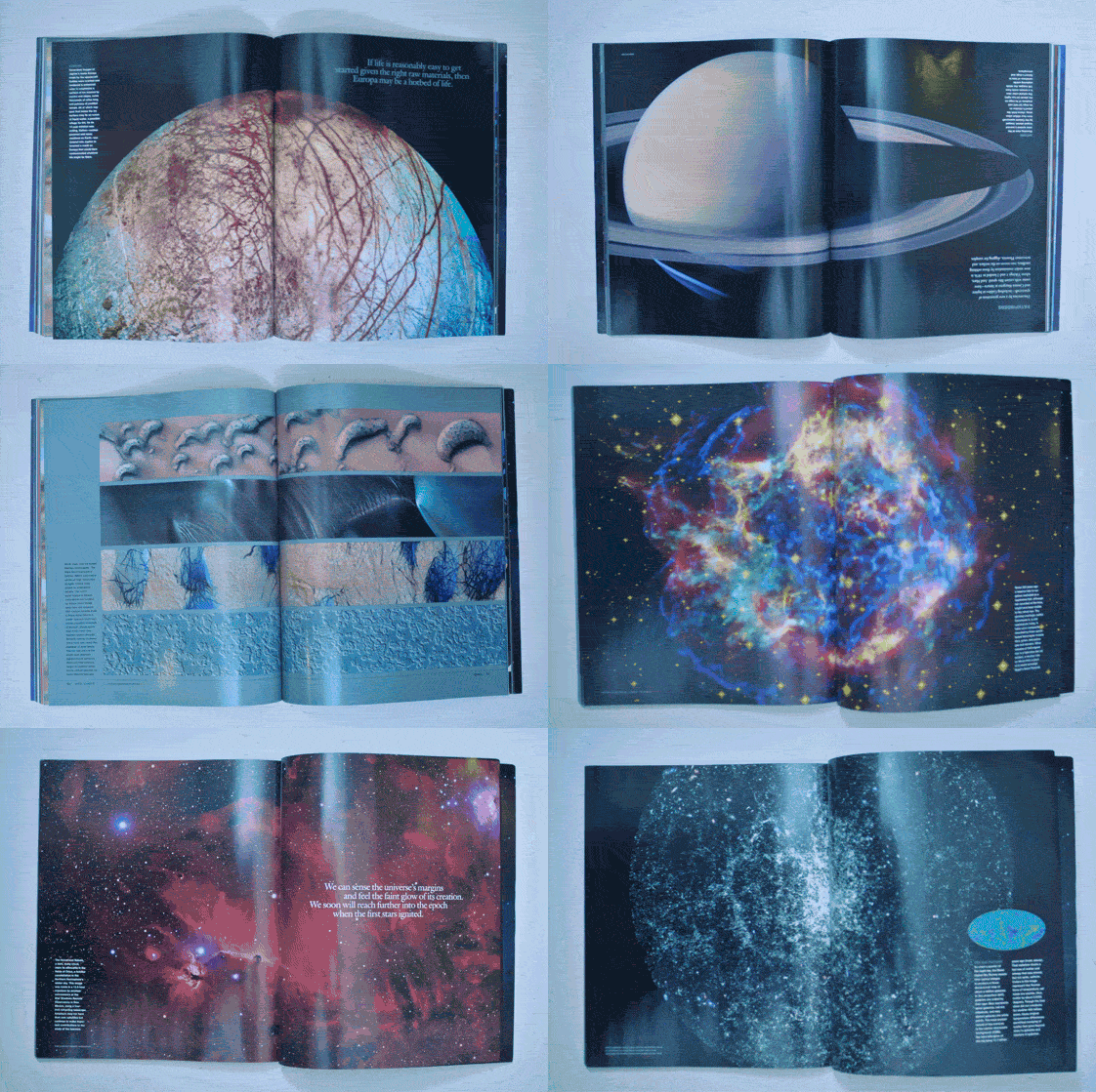
Following on from my previous post about the Solar System wall chart; I bought a couple of magazines - National Geographic Space and Astronomy Now.


Astronomy Now was a little too 'astronomy' for me. Lots of articles about choosing telescopes, astronomy clubs etc, however the National Geographic magazine had some stunning imagery and overall was a really good, well designed magazine (as well as having a free wall chart).

Here's some of my favorite photographs:


Photobucket


There is also some cool info graphics:


Sunday 23 November 2008

Space

I am doing an ISTD brief that involves choosing a title from a list - 10 things you should know about... I chose science as this seemed like it would have some really interesting imagery, as well as typography (as a lot of scientific theory seems to be based around letters/numbers/formulas).

We then have to divide this publication into 10 sections, each of the sections has ten facts. All we need to produce is one of the sections.

I have decided to to Astronomy, for 2 reasons: there is some stunning imagery, there are nine planets (plus 1 Sun) in the Solar System (there are actually 8 planets - pluto has been reclassified as a dwarf planet, but it is still worth including).

Some inspirational space imigary:


I think it would be really cool if I could some how interporate this kind of imigery typographically. Maybe do some kind of booklet that folds out into a wall chart.


Friday 21 November 2008

Converge: a new direction

I have decided that doing spreads using my friends names in them is a little too National Diploma, so I have decided to make this a branding brief.

I have decided to keep the existing logo, but use it to brand an art centre.

Here are some initial business card ideas, on some of them I have quickly mocked up a spot varnish, as this would be good to experiment with.


I have also been playing about with how the brand can be used in print ads. Here is a poster for a fictional exhibition:


This is much better than a magazine. Although its fictional, the content I'm using is the brand that I created, so it feels much more real.

Thursday 20 November 2008

Interim Evaluation

Read my interim evaluation by clicking here

Tuesday 18 November 2008

NMM revisited

From the feedback from last weeks crit, and Josh at Thompson, I have made some adjustments to the NMM Summer Seasonal print.


I have changed the text colour in places, to make the colours more cohesive, and in parts more legible. I have also changed some of the page colours/images and removed rain from the clouds to brighten the booklet up and make it feel less 'rainy'.
I have also simplified the front cover so that you 'get it' more easily.

Converge Spreads

I have decided to layout an 'editor's comment' type thing to outline my rational for this brief. Sort of.

Below are some spreads from magazines to see how they arrange the 'editor's comment thing', contents, contributors, etc.


Astronomy Now has the editor's comment and contents on the same spread

Adbusters, as usual, is unconventional and just seems to have writers and artists


National Geographic Space has the contents on a seperate page to the editor's comment


Plastique has the contents (not shown), forward, and contributers all on separate spreads


Woman and Home - 2 pages of contents and one page of credits


Psychologies - 2 pages of contents and an editors comment on separate spreads

I decided to go with the contents and the editors comment, which I have called Prefix, on one spread: